When to take a shower during war time
Excel: JSON, Append; Tableau visualizations
The current ongoing October war-time in Israel can cause anxiety for some, like a kid living in the same building as I do. His parents told me he refuses to do the below example activities, in fear of alarms happening during that very same time.
We’ll try to convince him using data!
In this piece I briefly describe how I've created a Tableau dashboard using alarms data of Pikud HaOref to help people.
So find out when you are least/most likely to be disturbed by rocket alerts here:
https://public.tableau.com/views/alarmsatIsrael/Dashboard1?:language=en-US&:display_count=n&:origin=viz_share_linkGetting the data
The source of the data was Pikud HaOref’s website. So this data is official data.
Obtain the data effortlessly using this link, adjust the dates as you please, and save as JSON files:
https://www.oref.org.il//Shared/Ajax/GetAlarmsHistory.aspx?lang=en&fromDate=07.10.2023&toDate=28.10.2023&mode=0Note that the data is limited to 2,000 cases per calendar day, which is a possible weakness one has to pay attention to. In this case, it was not an issue since I had no plan to include the first day of the war (October 7th) as it represented an extreme day which was far from representing subsequent days of war-routine.
The Excel Part
Load each JSON file, run it through the quick process of instructing Excel to re-organize/structure the data from JSON format to tabular data.
Iterate per JSON file that you have.
Time to Append the data (i.e. similar to UNION ALL in SQL).
*Please ensure you have the same amount of columns and in the same order. If you play around with it, you might not be able to properly append the data.
Alternatively, you may append the tables by “standing” on one of the fields in one of the data tables. Then do as in the image below:
Now it as if we’ve stacked the data tables one of top of each other, similar to SQL Union All. But in SQL we’d use UNION to ensure we have unique rows only. Proceed as in the image below to remove duplicate rows:
Now I merely recommend to assign the proper fields format per column in Excel, particularly if you are using the free version of Tableau.
The Tableau Part
I explain how I handled key parts in Tableau to create this dashboard. Tableau is ever-evolving and it’s out of scope to teach it from scratch.
I recommend beginners to do a course and then practice with ChatGPT instructions instead of frustrating yourself/wasting time in figuring out how to do stuff.
I chose which visualizations to use, choice of style, colors, et cetera, based on a summary of a book I’ve read (storytelling with data: a data visualization guide for business professionals). I recommend Cole Nussbaumer Knaflic’s website. She even shares some Excel template files!
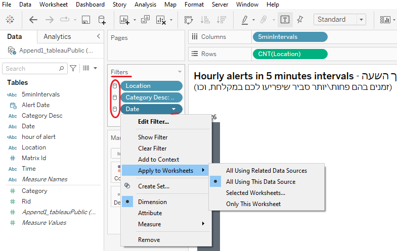
Filter
Regardless if you work on the Tableau Desktop or via the browser, set the scope of the data, and ensure it is connected/linked or disconnected/not linked as appropriate in adjusting the dashboard, per visualization.
In this case, I needed all visualizations to be connected and have the same scope.
Excluded October 7th data (extreme outlier).
Category Desc set only for ‘Missiles’.
Location to include all as-is. Adjustment to happen only on the dashboard itself.
Calculated Fields
(1) “5minIntervals”: Since Tableau’s CASE WHEN is different from what I’m used to, I opted for the following code in the calculated field:
IF DATEPART('minute', [Alert Date]) >= 0
 AND DATEPART('minute', [Alert Date]) < 5 THEN '00-04'
ELSEIF DATEPART('minute', [Alert Date]) >= 5
 AND DATEPART('minute', [Alert Date]) < 10 THEN '05-09'
ELSEIF DATEPART('minute', [Alert Date]) >= 10
 AND DATEPART('minute', [Alert Date]) < 15 THEN '10-14'
ELSEIF DATEPART('minute', [Alert Date]) >= 15
 AND DATEPART('minute', [Alert Date]) < 20 THEN '15-19'
ELSEIF DATEPART('minute', [Alert Date]) >= 20
 AND DATEPART('minute', [Alert Date]) < 25 THEN '20-24'
ELSEIF DATEPART('minute', [Alert Date]) >= 25
 AND DATEPART('minute', [Alert Date]) < 30 THEN '25-29'
ELSEIF DATEPART('minute', [Alert Date]) >= 30
 AND DATEPART('minute', [Alert Date]) < 35 THEN '30-34'
ELSEIF DATEPART('minute', [Alert Date]) >= 35
 AND DATEPART('minute', [Alert Date]) < 40 THEN '35-39'
ELSEIF DATEPART('minute', [Alert Date]) >= 40
 AND DATEPART('minute', [Alert Date]) < 45 THEN '40-44'
ELSEIF DATEPART('minute', [Alert Date]) >= 45
 AND DATEPART('minute', [Alert Date]) < 50 THEN '45-49'
ELSEIF DATEPART('minute', [Alert Date]) >= 50
 AND DATEPART('minute', [Alert Date]) < 55 THEN '50-54'
ELSE '55-59'
END
(2) Formatted Hour of Alert: (Hours alerts happened - השעות בהן היו אזעקות)
STR(DATEPART('hour', [Alert Date])) +
IF DATEPART('hour', [Alert Date]) < 12 THEN " AM" ELSE " PM" END
(3) Choosing the right filter, showing legends, and choosing proper titles is key.
I’m not saying mine are perfect, but it’s always better to invest time into thinking about those stuff than cracking how to do something on your own instead of getting guidance from ChatGPT etc. Keep it in mind.
Please keep in mind that the terrorists may change their modus operandi and then the dashboard’s assessment would no longer be relevant.


